Probability Distributions and Introduction to Statistical Inference
Lecture
R content
There is no separate R lab for today’s lecture. Instead, R code is (mostly) integrated into the slides. See below for an overview of all code presented in the slides.
R distribution functions
| Function Template | Purpose | Binomial | Normal |
|---|---|---|---|
dxxx() |
Returns the density (height of PMF/PDF) | dbinom(k, n, p) |
dnorm(x, mean, sd) |
pxxx() |
Returns cumulative probability, P(X<=x) | pbinom(k, n, p) |
pnorm(q, mean, sd) |
qxxx() |
Returns the quantile (x-coordinate) from a given CDF probability | qbinom(k, n, p) |
qnorm(p, mean, sd) |
rxxx() |
Generate N random numbers from distribution | rbinom(N, n, p) |
rnorm(N, mean, sd) |
Note that all functions for the Normal distribution will assume standard normal if mean and standard deviation arguemnts are not provided. For example, R will interpret pnorm(5) as pnorm(5,0,1).
New ggplot functions
| Function | Purpose | Example |
|---|---|---|
geom_text() |
Add text to a plot | geom_text( x=xcoordinate, y=ycoordinate, label = "text") (Note, these can all be aesthetics) |
geom_vline() |
Add a vertical line to a plot | geom_vline(xintercept=3) |
geom_hline() |
Add a horizontal line to a plot | geom_hline(yintercept=3) |
geom_abline() |
Add a generic line of formula y=ax+b to a plot | geom_abline(yintercept=3, slope = -2) |
scale_x_continuous() |
Customize a continuous x-axis | scale_x_continuous(name = "axis label", breaks=c(...), labels=c(...)) |
scale_y_continuous() |
Customize a continuous y-axis | scale_y_continuous(name = "axis label", breaks=c(...), labels=c(...)) |
Examples
Reading and writing files with readr
library(readr)

### Read a csv (comma-separated values) ###
data <- read_csv("file.csv")

### Read a tsv (tab-separated values) ###
data <- read_tsv("file.tsv")

### Write a csv ###
example <- tibble(x = 1:10, y = 2:11)
write_csv(example, "file.csv")

### Write a tsv ###
example <- tibble(x = 1:10, y = 2:11)
write_tsv(example, "file.tsv")
Drawing random sample of rows with dplyr
## Sample 50 random rows from iris without replacement
iris %>% sample_n(50) -> iris50

## Sample 50 random rows from iris with replacement
iris %>% sample_n(50, replace=TRUE) -> iris50

## Sample 50%*nrow(iris) random rows from iris without replacement
iris %>% sample_frac(0.5) -> iris125

## Sample 50%*nrow(iris) random rows from iris with replacement
iris %>% sample_frac(0.5, replace=TRUE) -> iris125
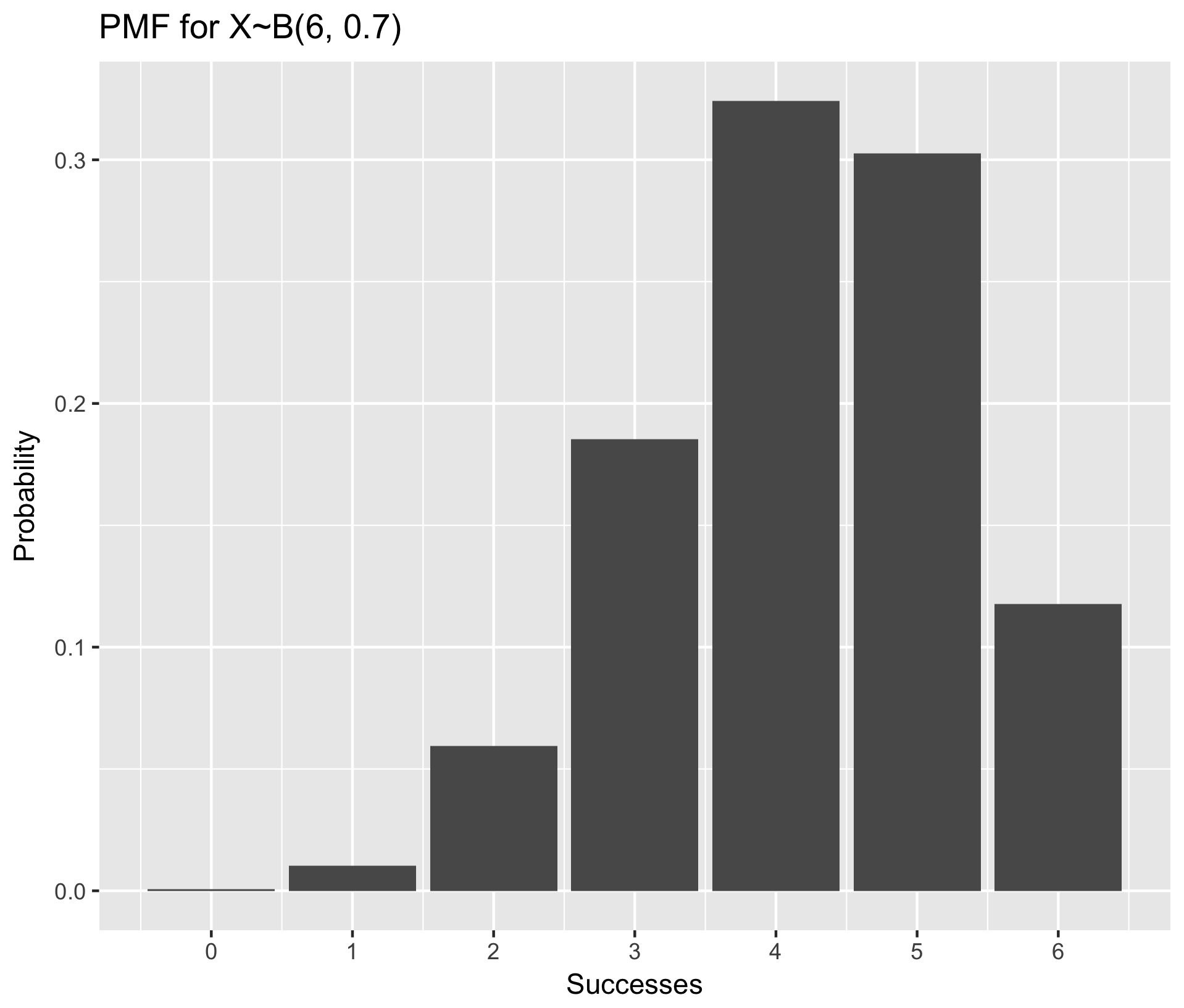
Visualize PMF using example X~B(6, 0.7) (ie, n=6, p=0.7)
library(purrr) ## Necessary for the map_dbl() function in step one

## Step One: Generate the data frame of probabilities for all k in 0:n
n <- 6
p <- 0.7
data.pmf <- tibble(k = 0:n, prob = map_dbl(0:n, dbinom, n, p))

## Step Two: make a bar plot with stat="identity" to make bar heights equal to their value in the data frame
ggplot(data.pmf, aes(x = k, y = prob)) +
	geom_bar(stat = "identity") +
	scale_x_continuous(name = "Successes", breaks=0:n) +
	ylab("Probability") +
	ggtitle("PMF for X~B(6, 0.7)")
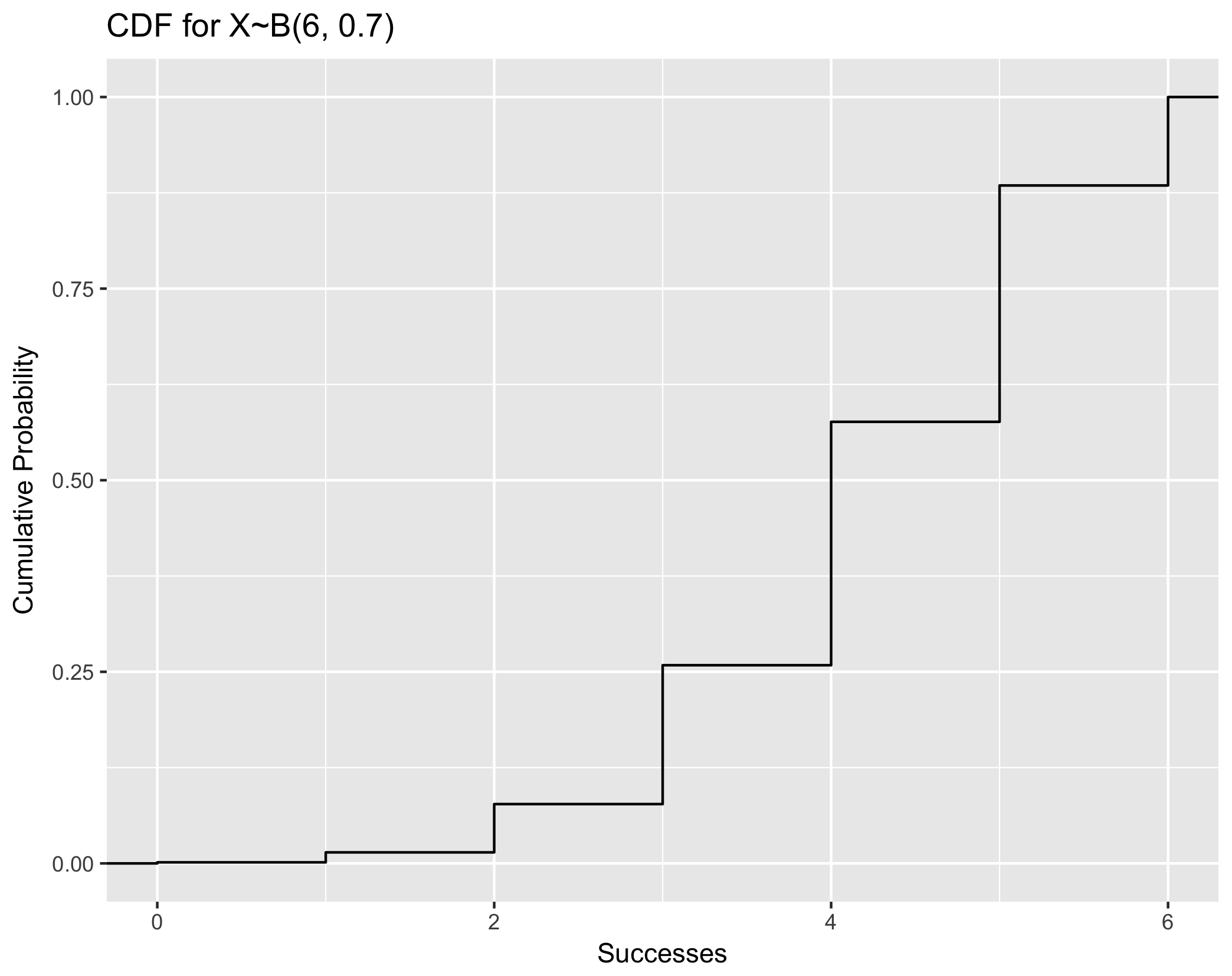
Visualize CDF using example X~B(6, 0.7)
### Note that this plotting framework is generally applicable to both discrete and continuous CDF. ###

## Step One: Generate random numbers from the distribution of interest. Here, we generate 5000
data.cdf <- tibble(x = rbinom(5000, 6, 0.7))

## Step Two: plot with stat_ecdf()
ggplot(data.cdf, aes(x = x)) +
	stat_ecdf() +
	xlab("Successes") +
	ylab("Cumulative Probability") +
	ggtitle("CDF for X~B(6, 0.7)")
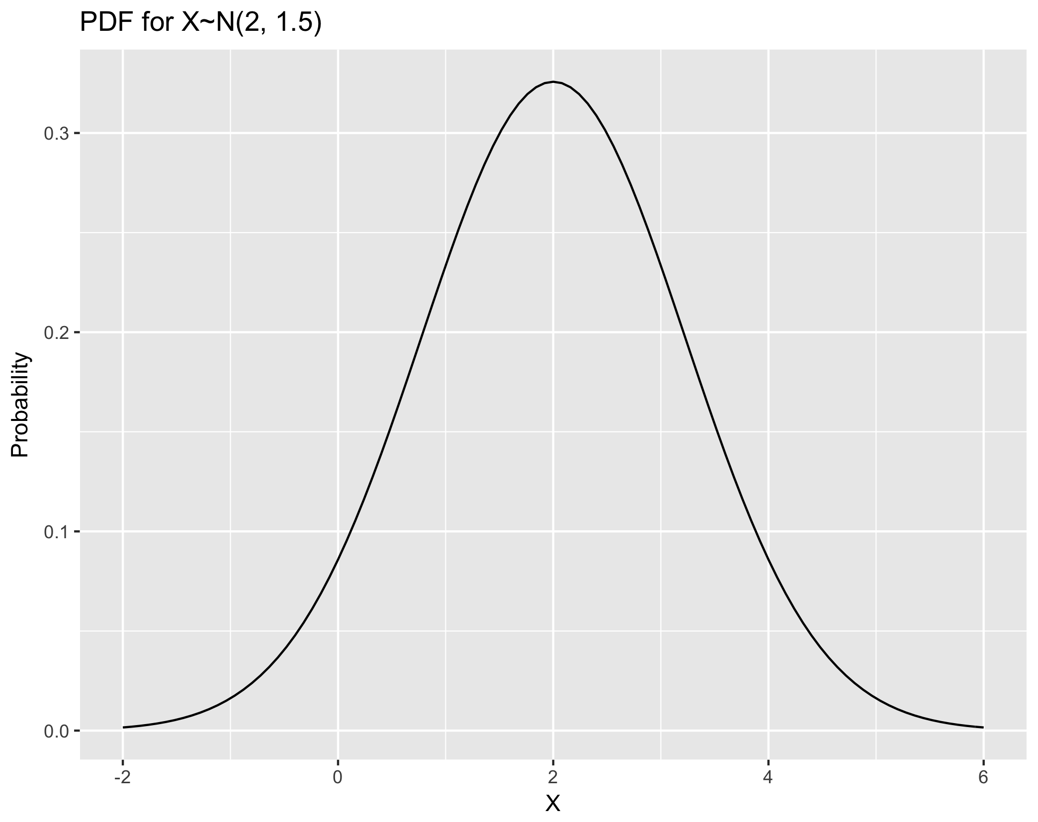
Visualize PDF using example X~N(2, 1.5) (i.e. mean=2, variance=1.5)
## Step One: Create a data frame giving the x-axis range. +/- 3sd is usually ok
range.pdf <- tibble(x = c(2 - 4, 2 + 4))

## Step Two: plot with stat_function
ggplot(range.pdf, aes(x = x)) +
	stat_function(fun = dnorm, args = list(mean = 2, sd=sqrt(1.5) )) +
	xlab("X") +
	ylab("Probability") +
	ggtitle("PDF for X~N(2, 1.5)")