Inclass exercises solutions, Day VII
Follow this link for day 7 materials and notes
Sign Test
Weddell seals live in the Antarctic and feed on fish during long, deep dives in freezing water. The seals benefit from these feeding dives, but the food they gain comes at a metabolic cost as the dives are highly strenuous.
A set of researchers wanted to know whether these feeding long dives incurred an energetic expense, beyond the exertion a seal would experience while diving but not feeding. Researchers measured the oxygen use of seals as they surfaced for air after a dive. For 10 seals, they measured oxygen use (in ) of 1 feeding dive and 1 non-feeding dive. Download the data here.
Does feeding influence the metabolic costs of a dive?
Take the following steps:
- Examine the data, i.e. look at it!
- Understand why the sign test is appropriate here
- State the null, alternative hypotheses
- Conduct the test
- Report results, conclusions
Solution
Ho: Feeding does not influence the metabolic cost of a dive.
Ha: Feeding influences the metabolic cost of a dive.
seals <- read.csv("seals.csv")

### Count signs. For a paired analysis, we have null = 0 so can just look at sign of differences directly.
seals %>%
	mutate(diff = Oxygen_use_nonfeeding - Oxygen_use_feeding) %>%
	mutate(sign = sign(diff)) %>%
	group_by(sign) %>%
	tally()
#	# A tibble: 2 x 2
#	   sign     n
#	1    -1     8
#	2     1     2

binom.test(8, 10, 0.5)
#	Exact binomial test
#
#data:  8 and 10
#number of successes = 8, number of trials = #10, p-value = 0.1094
#alternative hypothesis: true probability of success is not equal to 0.5
#95 percent confidence interval:
# 0.4439045 0.9747893
#sample estimates:
#probability of success
#                   0.8
Results and conclusions: Our P=0.1094 is larger than . We fail to reject the null hypothesis and conclude that there no is evidence feeding influences the metabolic cost of a dive.
Wilcoxon signed-rank test
Re-analyze the seal data above using a two-tailed Wilcoxon signed-rank test.
Take the following steps:
- State the null, alternative hypotheses
- Conduct the test
- Report results, conclusions
- Understand any differences in outcome between tests
Solution
Ho: Feeding does not influence the metabolic cost of a dive.
Ha: Feeding influences the metabolic cost of a dive.
seals <- read.csv("seals.csv")

### Count rank signs. For a paired analysis, we have null = 0 so can just look at sign of differences directly.
seals %>%
	mutate(diff = Oxygen_use_nonfeeding - Oxygen_use_feeding) -> seals.diff

wilcox.test(seals.diff$diff, mu=0)
#	Wilcoxon signed rank test
#
#data:  seals.diff$diff
#V = 3, p-value = 0.009766
#alternative hypothesis: true location is not equal to 0


##Examine data for directional conclusion
seals %>%
	mutate(nonfeeding_more = Oxygen_use_nonfeeding > Oxygen_use_feeding) %>%
 	group_by(nonfeeding_more) %>%
	tally()
## A tibble: 2 x 2
#  nonfeeding_more     n
#1           FALSE     8
#2            TRUE     2
Results and conclusions: Our test statistic is V=3, and our P=0.009766 is less than . We reject the null hypothesis and conclude that there is evidence feeding influences the metabolic cost of a dive. We further conclude that there is evidence that feeding increases the cost of a dive.
Note that this result is different from the sign test because it has more power (due to consideration of ranks), but use of the Wilcoxon signed-rank test may not always be warranted to due to its assumption that data is symmetrical. Violating this assumption can lead to an elevated false positive rate.
Mann Whitney U test
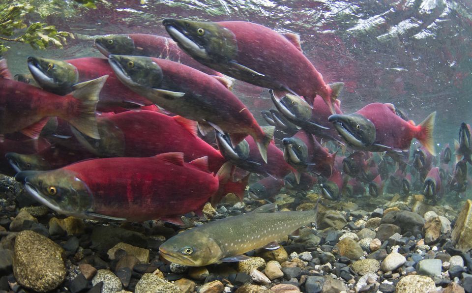
Sockeye salmon swim hundreds of miles from the Pacific Ocean, where they grow up, to rivers for spawning. Kokanee salmon, by contrast, are a type of freshwater sockeye that spend their entire lives in lakes before swimming upriver to mate. In both types of fish, the males are bright red during mating. This red coloration is caused by carotenoid pigments, which the fish cannot synthesize but sequester from their food. The ocean environment is much richer in carotenoids than the lake environment, which raises the question of how the kokanee males are as red as the sockeye when the kokanee do not live in the ocean.
Researchers hypothesized that kokanee might be more efficient at using available carotenoids than the sockeye. They tested this hypothesis in an experiment where both sockeye and kokanee individuals were raised in the lab with low levels of carotenoids in their diets (Craig and Foote 2001). Their skin color was measured electronically. Download the data here.
Do sockeye and kockanee tend to have different skin colors in this experiement?
Take the following steps:
- Read in and examine the data
- Understand why the Mann Whitney U test is appropriate here (but a two-sample t-test might not be)
- State the null, alternative hypotheses
- Conduct the test
- Report results, conclusions
Solution
Ho: Sockeye and kokanee tend to the same skin color.
Ho: Sockeye and kokanee tend to have different skin color.
salmon <- read.csv("sockeye_kokanee.csv")
head(salmon)
#  species skin_color
#1 kokanee       1.11
#2 kokanee       1.34
#3 kokanee       1.55
#4 kokanee       1.53
#5 kokanee       1.50
#6 kokanee       1.71

## Run the test using ~ notation
wilcox.test(skin_color ~ species, data = salmon)
#	Wilcoxon rank sum test
#
#data:  skin_color by species
#W = 264, p-value = 9.77e-09
#alternative hypothesis: true location shift is not equal to 0

## Examine data for directional conclusion
salmon %>%
	group_by(species) %>%
	summarize(median(skin_color))
# A tibble: 2 x 2
#  species `median(skin_color)`
#1 kokanee                1.710
#2 sockeye                0.985
Results and conclusions: Our test statistic is W=264, and our P=9.77e-09 is less than . We reject the null hypothesis and conclude that there is evidence that sockeye and kokanee salmon tend to have different skin colors. We further conclude kokanee tend towards more intense (higher measures) skin colors than sockeye.
Tidying data with tidyr
Question 1
The dataset pew.csv reports results from a Pew poll on world religions, where it asked individuals with which religion (if any) they affiliate. Results were tabulated based on income levels. Use tidyr to tidy up this dataset.
Solution
pew <- read.csv("pew.csv")

### Via head(), we see that categories for the variable "income" are columns.
head(pew)
#     religion below10k from10to20k from20to30k from30to40k from40to50k
#1    Agnostic       27          34          60          81          76
#2     Atheist       12          27          37          52          35
#3    Buddhist       27          21          30          34          33
#4    Catholic      418         617         732         670         638
#5 Evangelical      575         869        1064         982         881
#6       Hindu        1           9           7           9          11
#  from50to75k
#1         137
#2          70
#3          58
#4        1116
#5        1486
#6          34

pew %>% gather(income_level, count, below10k:from50to75k) -> tidy.pew
head(tidy.pew)
#     religion income_level count
#1    Agnostic     below10k    27
#2     Atheist     below10k    12
#3    Buddhist     below10k    27
#4    Catholic     below10k   418
#5 Evangelical     below10k   575
#6       Hindu     below10k     1
Question 2
As it turns out, some results from the poll were missing but later recovered! They are found in pew2.csv. Make this dataset tidy, and then create a single dataset that combines pew.csv and pew2.csv into a single tidy dataframe.
Solution
pew2 <- read.csv("pew2.csv")

### Via head(), we see that categories for the variable "income" are columns.
head(pew2)
#     religion from75to100k from100to150k above150k no_answer
#1    Agnostic          122           109        84        96
#2     Atheist           73            59        74        76
#3    Buddhist           62            39        53        54
#4    Catholic          949           792       633      1489
#5 Evangelical          949           723       414      1529
#6       Hindu           47            48        54        37

pew2 %>% gather(income_level, count, from75to100k:no_answer) -> tidy.pew2
head(tidy.pew2)
#     religion income_level count
#1    Agnostic from75to100k   122
#2     Atheist from75to100k    73
#3    Buddhist from75to100k    62
#4    Catholic from75to100k   949
#5 Evangelical from75to100k   949
#6       Hindu from75to100k    47


## Join together ##
final.pew <- left_join(tidy.pew, tidy.pew2)
Question 3
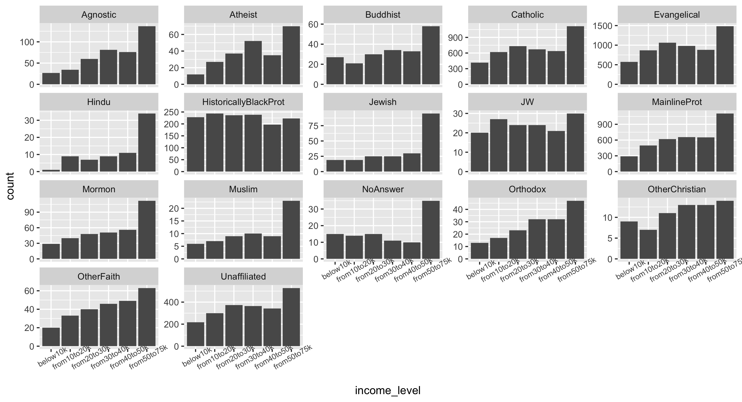
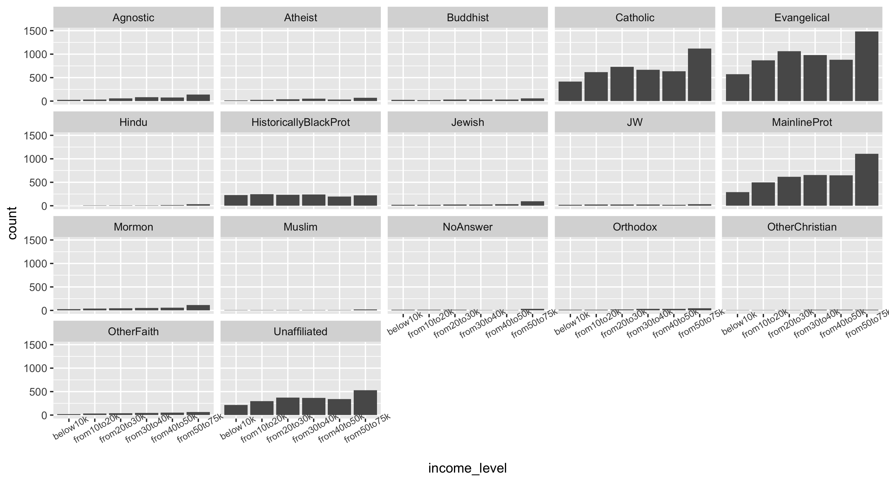
Using the final data frame, make a faceted histogram of incomes across religions.
Solution
This plot is shown plot in two different ways below using some fun ggplot features:
- Because we have the actual counts in the data, we must use
geom_bar(stat="identity")to make our histograms - We use
facet_wrap()instead offacet_grid()to get rows and columns in the faceting. Try both ways to compare! - Because the x-axis text is so large, we modify it with
theme(): give it a smaller size of 7.5 and angle it at 30 degrees. See the ggplot documentation for how to modify the theme - Because each facet has a different scale on the yaxis, we can also choose to supply
scales="free_y"to allow each facet to have its own scale. However this may lead to misinterpretations of the data (it may look like all groups have similar counts).
## Plot 1
final.pew %>%
	ggplot(aes(x = income_level, y = count)) +
	geom_bar(stat="identity") +
	facet_wrap(~religion) +
	theme(axis.text.x = element_text(size=7.5, angle=30))

## Plot 2
final.pew %>%
	ggplot(aes(x = income_level, y = count)) +
	geom_bar(stat="identity") +
	facet_wrap(~religion, scales="free_y") +
	theme(axis.text.x = element_text(size=7.5, angle=30))
Plot 1
Plot 2