Inclass exercises solutions, Day III
Exercises
Create the following figures for the R CO2 dataset using ggplot2. When applicable, use only one line of code to create each figure by piping commands together.
NOTE: For these solutions, the following command was run before generating any figures. This sets the ggplot theme to “classic” for all plots created in the R session:
theme_set(theme_classic())
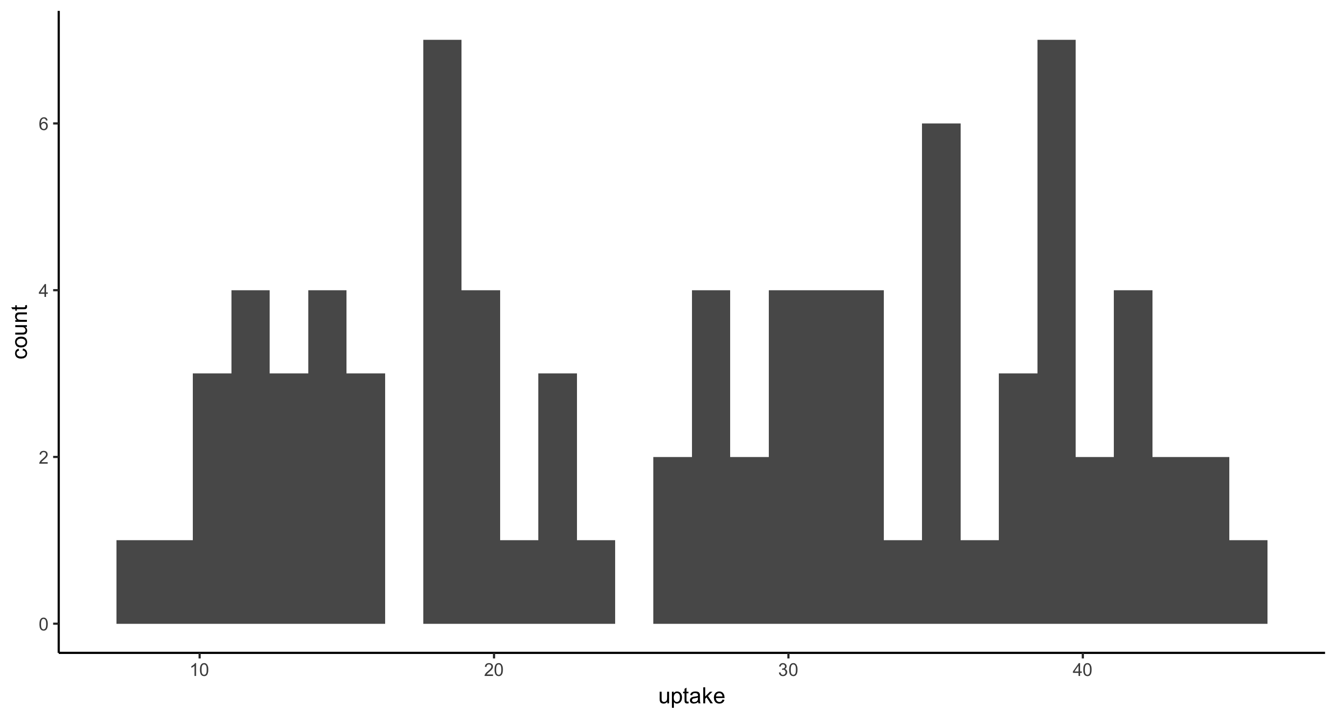
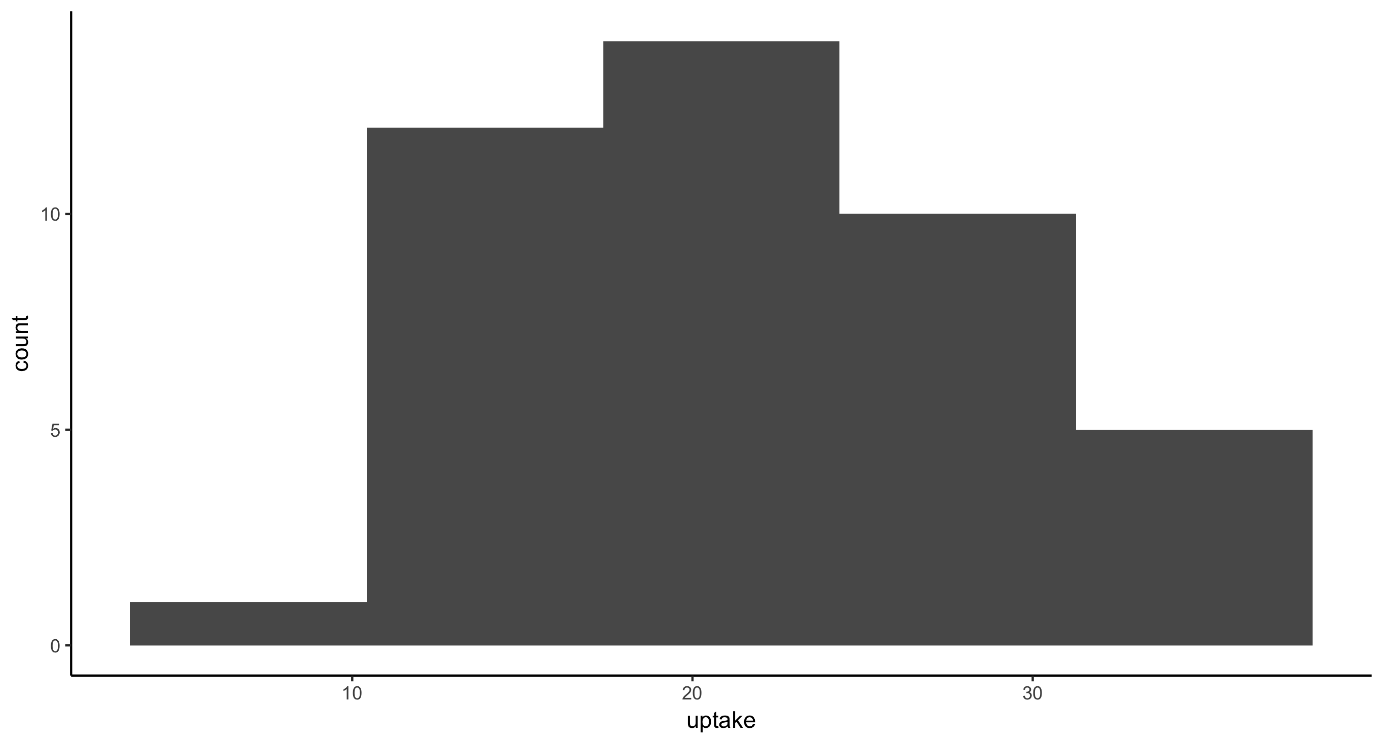
- Histogram of CO2 uptake values for all plants
ggplot(CO2, aes(x = uptake)) + geom_histogram()
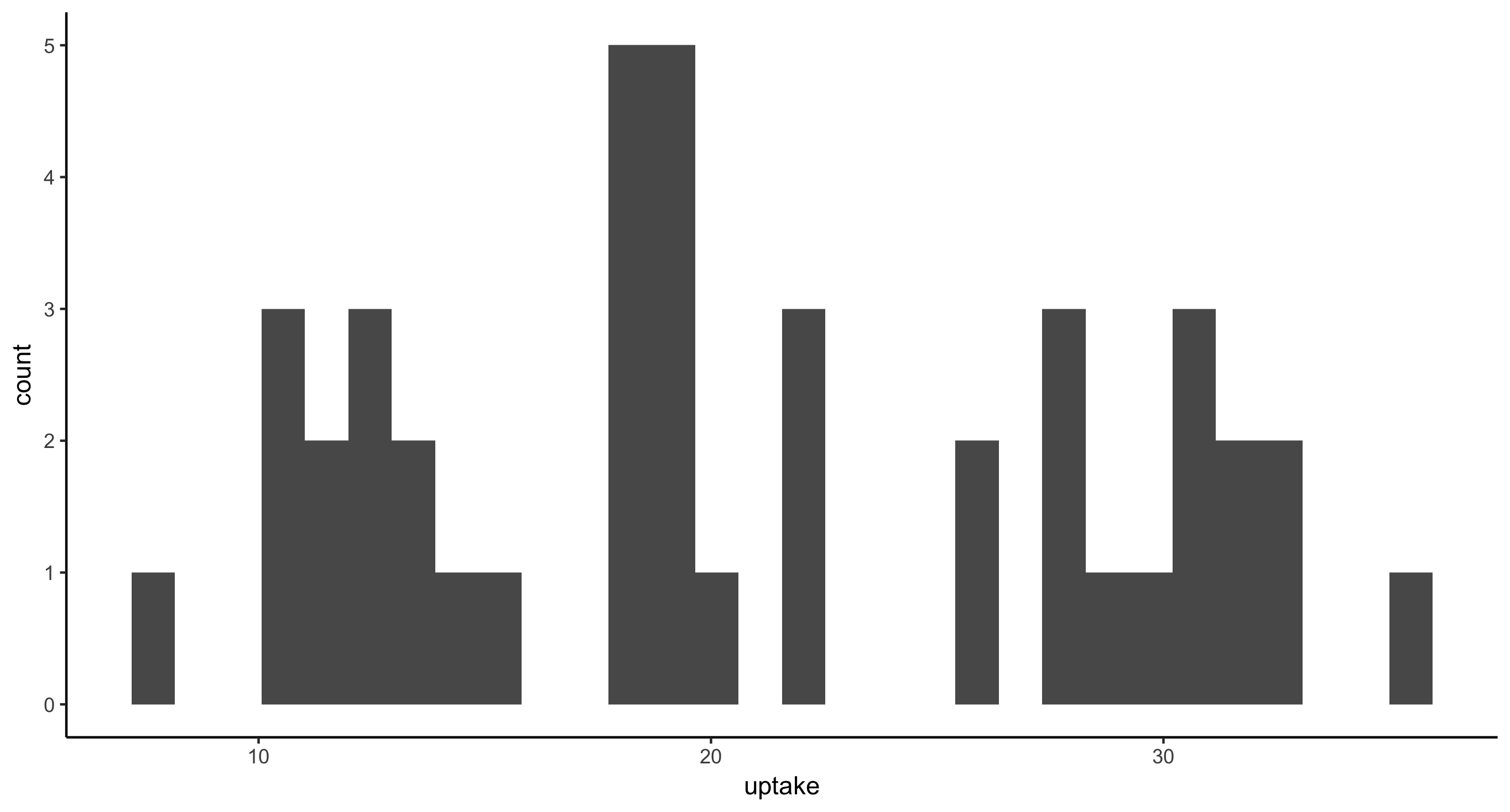
- Histogram of CO2 uptake values for all plants from Mississippi
CO2 %>%
	filter(Type == "Mississippi") %>%
	ggplot(aes(x = uptake)) + geom_histogram()
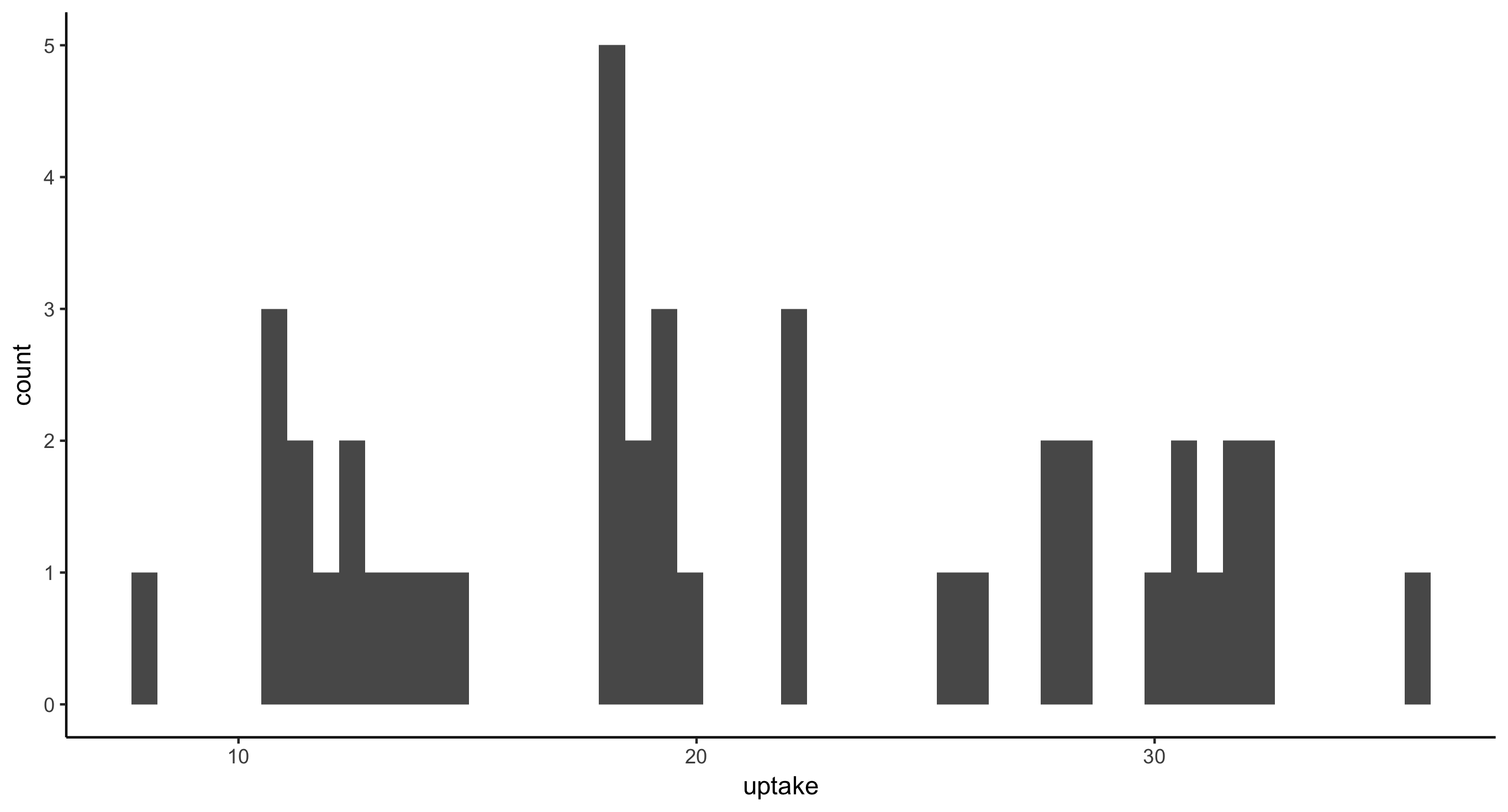
- Histogram of CO2 uptake values for all plants from Mississippi. This time, provide the argument
bins=50togeom_histogram(), as in: geom_histogram(bins=50). Then, providebins=5and finallybins=100. Think about how these plots compare and therefore what this argument is doing.
CO2 %>%
	filter(Type == "Mississippi") %>%
	ggplot(aes(x = uptake)) + geom_histogram(bins=50)
CO2 %>%
	filter(Type == "Mississippi") %>%
	ggplot(aes(x = uptake)) + geom_histogram(bins=5)
CO2 %>%
	filter(Type == "Mississippi") %>%
	ggplot(aes(x = uptake)) + geom_histogram(bins=100)
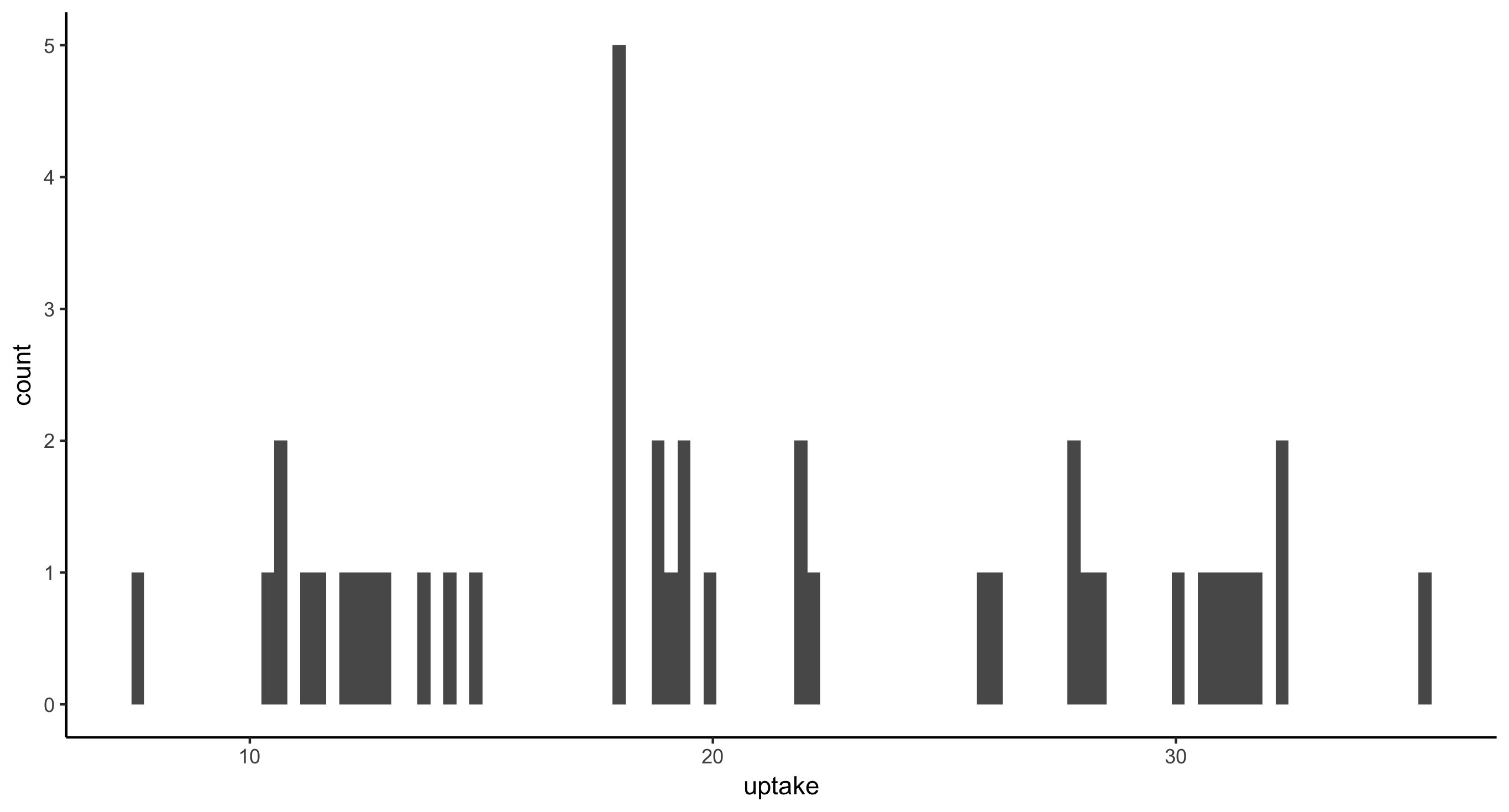
Fewer bins means less resolution in the histogram. More bins means thinner, finer bars.
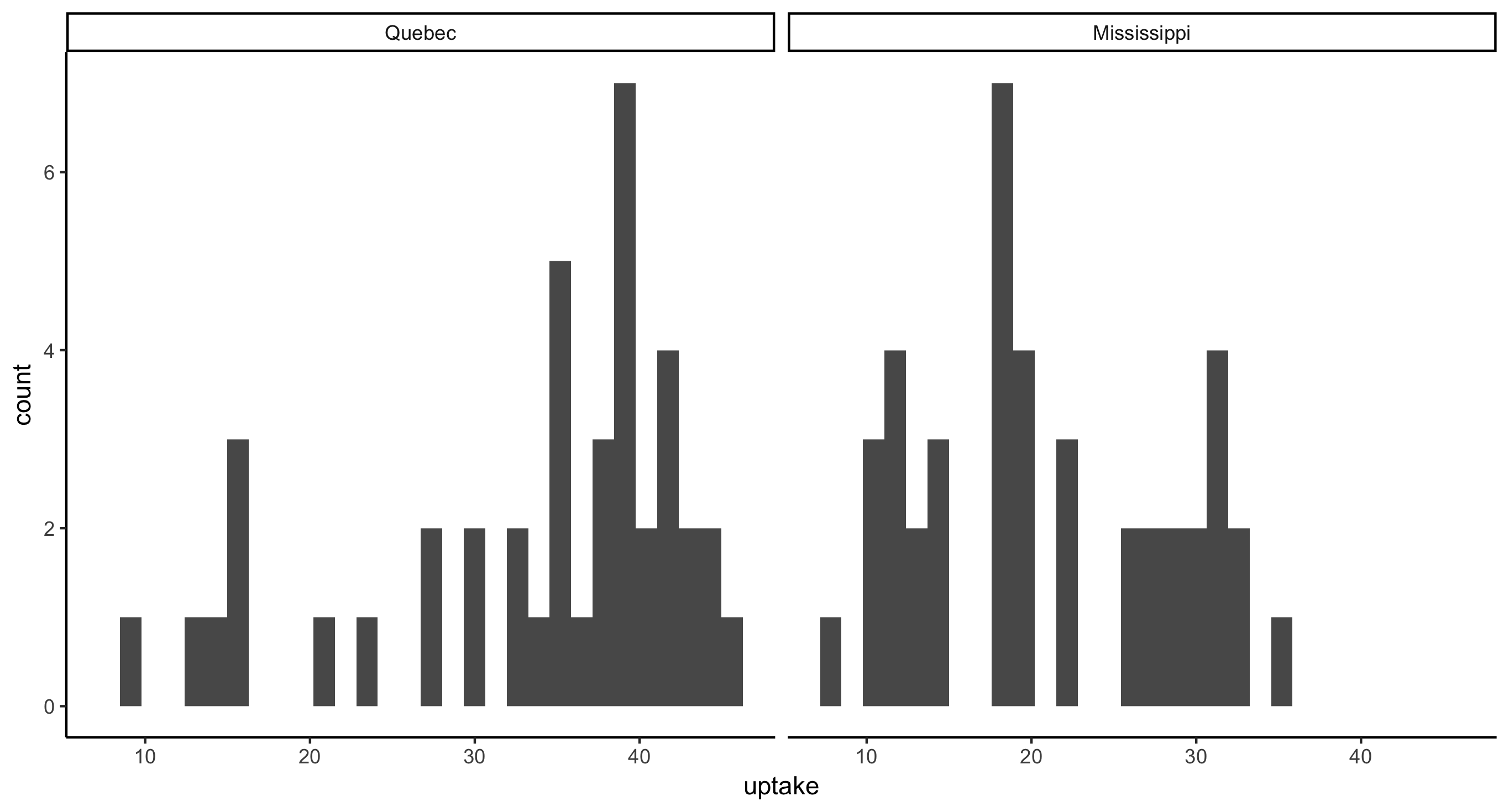
- Faceted histogram of CO2 uptake values across plant Type
ggplot(CO2, aes(x = uptake)) + geom_histogram() + facet_grid(~Type)
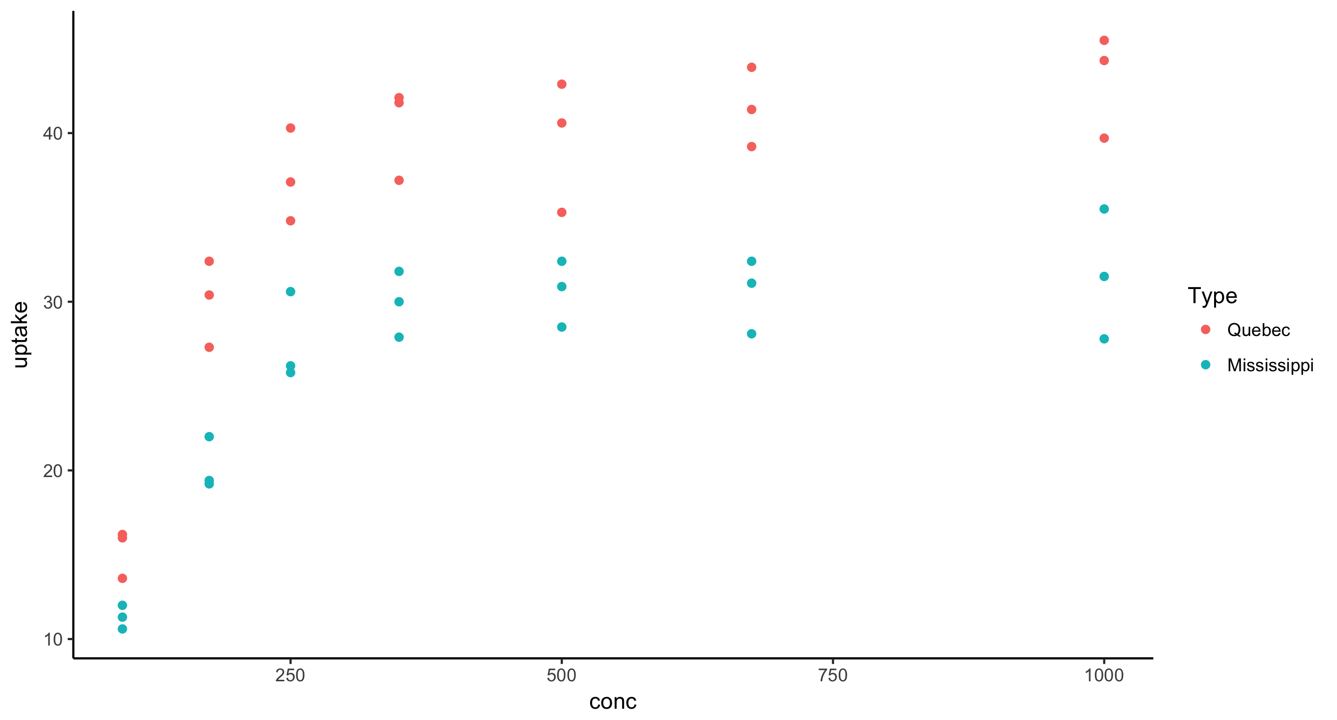
- Scatterplot of CO2 uptake against concentration (meaning uptake is the response variable) for all nonchilled plants, where points are colored by plant Type
CO2 %>%
	filter(Treatment == "nonchilled") %>%
	ggplot(aes(x = conc, y = uptake)) + geom_point(aes(color = Type))
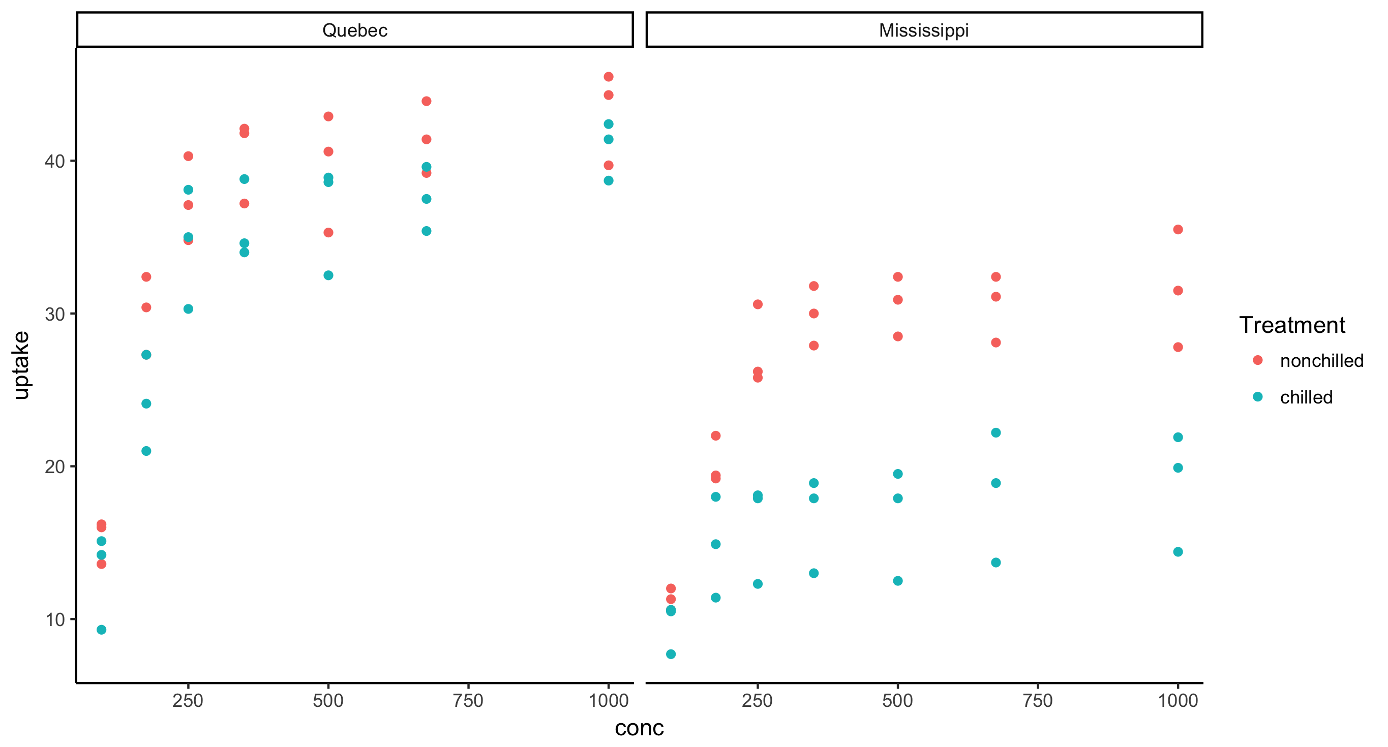
- Faceted scatterplot of CO2 uptake against concentration across plant Type, where points are colored by Treatment
CO2 %>%
	ggplot(aes(x = conc, y = uptake)) + geom_point(aes(color = Treatment)) + facet_grid(~Type)
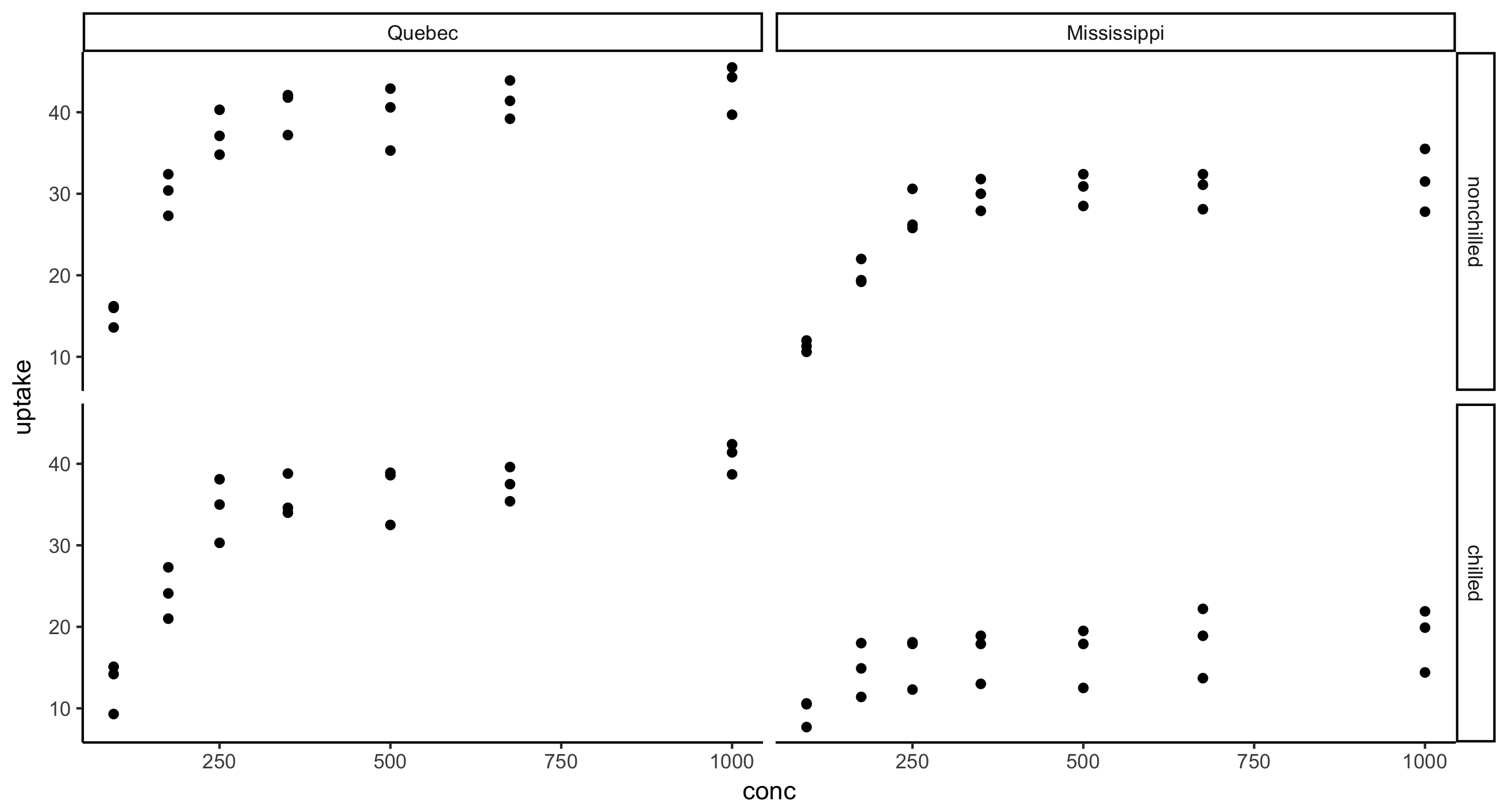
- Faceted scatterplot of CO2 uptake against concentration across plant Type and Treatment, i.e. the final figure should have 2 rows and 2 columns.
CO2 %>%
	ggplot(aes(x = conc, y = uptake)) + geom_point() + facet_grid(Treatment~Type)