Inclass exercises solutions, Day 10
Follow this link for day 10 materials and notes
LM 1
Using the dataset wine.csv, construct a linear model to predict flavanoid content across cultivars, while controlling for total phenol content. This type of linear model is also known as “ANCOVA” (we have one categorical and one numeric predictor, the latter of which is sometimes referred to as the “covariate”). Additionally visualize your data with a scatterplot, colored by cultivar.
> wine <- read.csv("wine.csv")
> wine$Cultivar <- factor(wine$Cultivar)

### Visualize data before running a model - this will help give you important context when interpreting the model.
> ggplot(wine, aes(x = TotalPhenol, y = Flavanoids, color = Cultivar)) + geom_point() + geom_smooth(method = "lm", aes(group = Cultivar))


### Build the model, interaction first
> fit <- lm(Flavanoids ~ TotalPhenol * Cultivar, data = wine)

### Examine model with broom functions
> tidy(fit)
                   term    estimate std.error  statistic      p.value
1           (Intercept)  0.30527782 0.3889524  0.7848719 4.336084e-01
2           TotalPhenol  0.94258285 0.1359981  6.9308530 8.060176e-11
3             Cultivar2 -0.47806091 0.4280505 -1.1168330 2.656234e-01
4             Cultivar3  0.14641141 0.4602699  0.3180990 7.507957e-01
5 TotalPhenol:Cultivar2  0.05509516 0.1562548  0.3525981 7.248214e-01
6 TotalPhenol:Cultivar3 -0.74614556 0.1976734 -3.7746375 2.203604e-04

> glance(fit)
  r.squared adj.r.squared     sigma statistic      p.value df    logLik
1 0.8799558     0.8764662 0.3510727  252.1611 3.377208e-77  6 -63.19569
       AIC      BIC deviance df.residual
1 140.3914 162.6639 21.19935         172
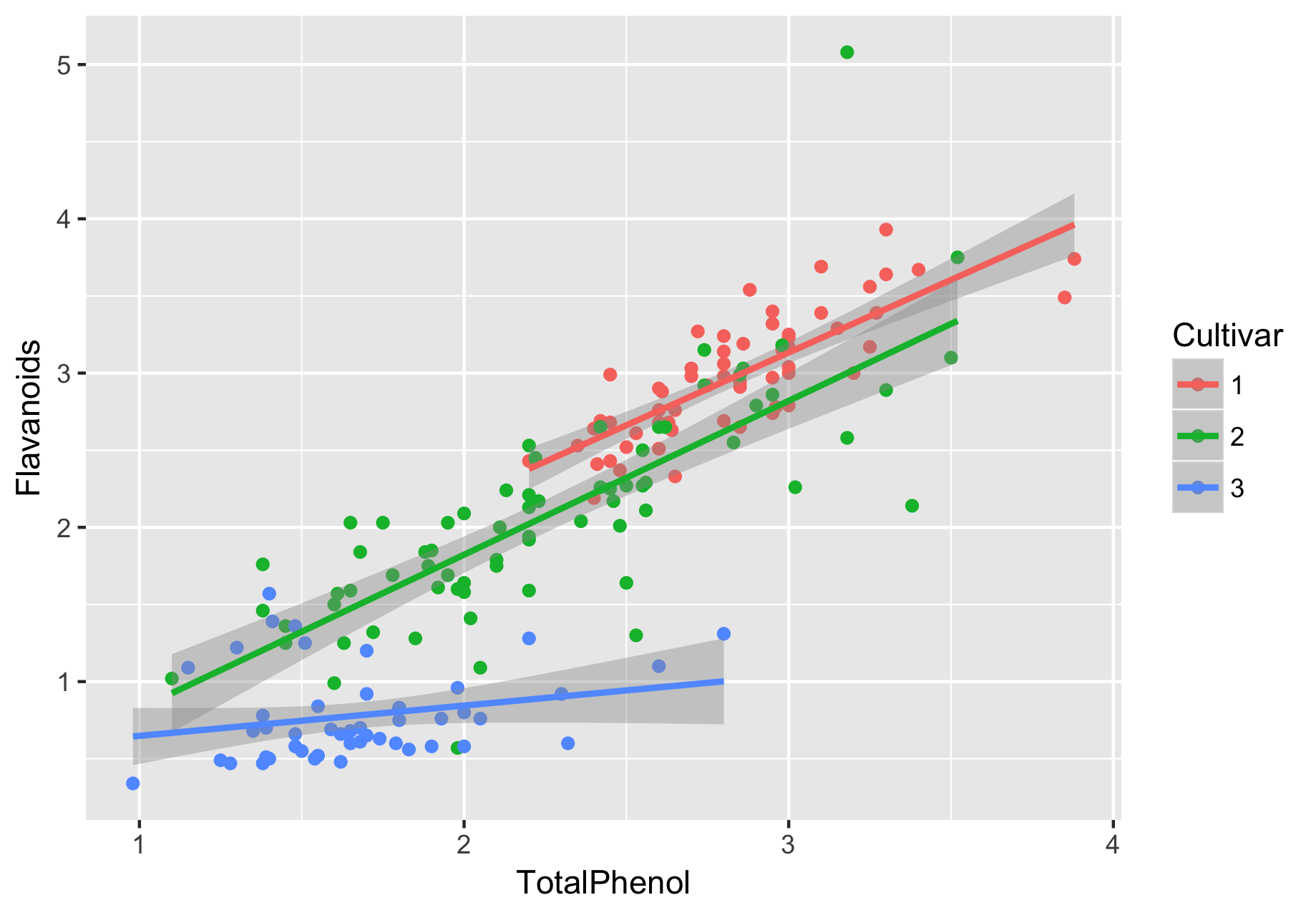
By looking at the figure first, we can get a sense of what to expect from our linear model:
- The three cultivars’ TotalPhenol appear to have a linear relationship with Flavanoids, where cultivars 1-2 appear similar to each other (in terms of how they relate to Flavanoids; on their own, it is clear that cultivar 1 generally has higher levels of flavanoids and total phenols compared to cultivar 1).
- Flavanoids from cultivars 1 and 2 appear to be more strongly related to total phenol, compared to cultivar 3.
- If there is an interaction effect, it is likely driven by cultivar 3.
And here is what we found from the model. Because one of the interaction effects is significant, we do not fit an additive model.
- The intercept coefficient represents the Flavanoid (response variable) level when TotalPhenol is equal to 0 and the Cultivar is Cultivar 1 (because of R’s ordering). Here, the intercept is 0.305, with a P-value of 0.4336, meaning there is no evidence it differs from 0. Therefore, we can conclude here that there is no evidence the Flavanoid content for a Cultivar 1 wine with 0 phenols differs from 0. You can basically think of it as the Cultivar1 Flavanoid level, for a model w/out TotalPhenol.
- The TotalPhenol coefficient represents: For every unit increase in totalphenol, the Flavanoid (response variable) will increase by 0.94. It is highly significant at P=8.06e-11.
- The Cultivar2 and Cultivar3 coefficients represent the change in Flavanoid (response variable) content relative to Cultivar 1. Compared to Cultivar1, Cultivar2 has -0.478 less Flavanoid content; compared to Cultivar1, Cultivar3 has 0.146 more Flavanoid content. However, these coefficients were not significant, so from this model, we have no evidence that Cultivars differ in Flavanoid level.
- Now the interaction effects. First, TotalPhenol:Cultivar2 is not significant, so there is no evidence for an interaction between Cultivar and TotalPhenol, in the context of Cultivar1 relative to Cultivar2. Remember, we interpret categorical predictors relative to the first level of the predictor (i.e. the one not explicitly shown in the output). By contrast, the TotalPhenol:Cultivar3 is significant. Therefore, there is evidence for an interaction between Cultivar and TotalPhenol, when Cultivar 1 and 3 are compared. These results will make the most sense in the context of the figure we made for the data, which is why it’s so critical to visualize your data.
Finally, we must consider our . This is an exceptionally high : 88% of the variation in Flavanoid content can be explained by Cultivar and TotalPhenol. Therefore, this is a very strong (highly predictive) model.
LM 2
Using the dataset wine.csv, construct a linear model to predict wine Color from all other columns as independent predictors. Note: If you are running this in a separate R session from question above, you will need to re-code wine$Cultivar as a factor. Fully interpret your model. Think carefully how to interpret the coefficient for Cultivar (the only categorical variable). How can you fully understand its effect?
Happily, R makes your life easy to include all “other columns” as predictors:
lm(Color ~ ., data = wine), where the “.” represents everything that isn’t Color.
> wine <- read.csv("wine.csv")
> wine$Cultivar <- factor(wine$Cultivar)

### Build the model
> fit <- lm(Color ~ ., data = wine)

### Examine model with broom functions
> tidy(fit)
             term     estimate   std.error  statistic      p.value
1     (Intercept) -9.340182204 3.014770067 -3.0981408 2.283194e-03
2       Cultivar2 -0.371065214 0.411567397 -0.9015904 3.685652e-01
3       Cultivar3  4.884855036 0.523433636  9.3323293 6.033831e-17
4         Alcohol  0.835189858 0.198429658  4.2089971 4.169037e-05
5       MalicAcid -0.291233262 0.107170029 -2.7174879 7.267479e-03
6             Ash -0.393274512 0.443348707 -0.8870546 3.763176e-01
7       Magnesium  0.008840287 0.007896491  1.1195209 2.645160e-01
8     TotalPhenol  0.122263234 0.323724507  0.3776768 7.061474e-01
9      Flavanoids  1.027341585 0.284700625  3.6084978 4.060286e-04
10 NonflavPhenols  2.031318806 1.045259504  1.9433632 5.364352e-02

> glance(fit)
  r.squared adj.r.squared    sigma statistic      p.value df    logLik      AIC
1 0.6916504     0.6751317 1.321359  41.87068 1.724521e-38 10 -297.0267 616.0533
      BIC deviance df.residual
1 651.053 293.3261         168
What have we got:
- The intercept coefficient represents the Color (response variable) level when all numeric predictors are equal to 0, and all categorical predictors are at their first level. Here, this means Cultivar1, and the rest are 0. When these conditions are met, we have evidence that the Color (response) is -9.34 (Note: I do not know much about how colors are measured, so this might not be a physically possible value, such is the way with intercepts!).
- We have no evidence that Cultivar 2 has a different effect on Color, compared to Cultivar1 (in the context of this model, see below!)
- For every unit increase in Alcohol, Color increases on average by 0.835.
- Compared to Cultivar1, Cultivar3 has 4.88 higher Color, on average.
- For every unit increase in MalicAcid, Color decreases on average by 0.291.
- We have no evidence that Ash affects Color
- We have no evidence that Magnesium affects Color
- We have no evidence that TotalPhenol affects Color
- For every unit increase in Flavanoids, Color increases on average by 1.027.
-
For every unit increase in NonflavPhenols, Color increases on average by 2.03. I’m including this predictor because it’s just on the cusp of significance, so its effect is quite weak.
- , which is fairly high. Roughly 70% of the variation in Color can be explained by this set of predictors. The model is quite good! Not the best model, but certainly not a poor model.
Now, what is going on w/ Cultivars exactly? Let’s run a quick ANOVA to see how Cultivar alone influences Color.
> fit <- aov(Color ~ Cultivar, data = wine)
> tidy(fit)
       term  df    sumsq     meansq statistic      p.value
1  Cultivar   2 551.4160 275.708001   120.664 1.162008e-33
2 Residuals 175 399.8615   2.284923        NA           NA
We have evidence that at least one Cultivar has a different color from the others. Let’s go further with a posthoc Tukey:
> TukeyHSD(fit)
  Tukey multiple comparisons of means
    95% family-wise confidence level

Fit: aov(formula = Color ~ Cultivar, data = wine)

$Cultivar
         diff       lwr       upr p adj
2-1 -2.441685 -3.071145 -1.812226     0
3-1  1.867945  1.173406  2.562484     0
3-2  4.309630  3.641940  4.977321     0
Why did the full linear model say that Cultivar1 and Cultivar2 had the “same” color, but the posthov ANOVA analyis shows that they are different? In fact, these results not necessarily inconsistent: The linear model had to consider all other quantities (covariates) as well, and hence the significance of observed effects was influenced by their presence. By contrast, the ANOVA does not include any covariates, and all signal gets to be attributed to Cultivar alone. The punchline: P-values for the same predictors will not be the same when you add/remove other predictors. This is because other predictors will be either better or worse than Cultivar will, which will influence the relative contributions and importance of Cultivar.
You’ll also note that directionality is the same for how cultivars relate: in both Tukey and the full linear model, cultivar 2 has less color than does 1 (it just wasn’t significant in the full model), and cultivar 3 has more color than does 1.
Logistic regresssion
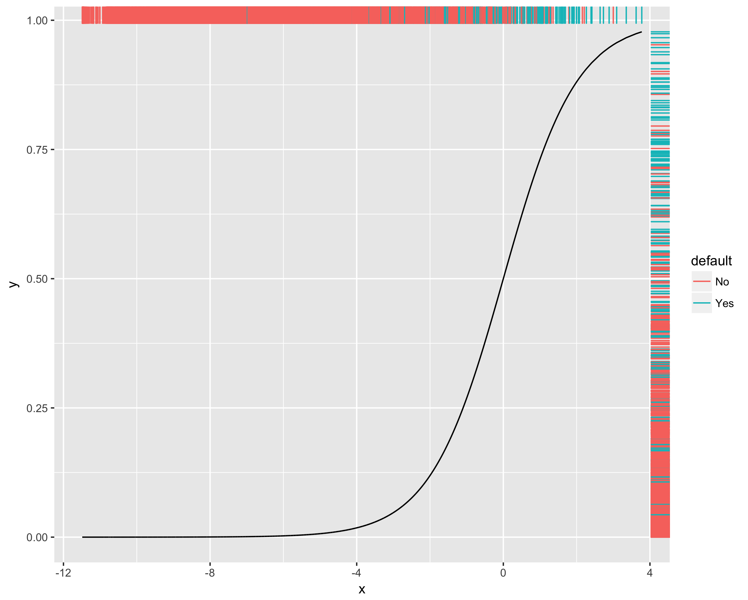
Here, we will use a dataset, default.csv indicating if invididuals defaulted on their credit debt. Construct a logistic regression to predict if an individual will default, and visualize your final logistic curve with a colored rug. Based on the plot, do you think this is a good model?
> default <- read.csv("default.csv")
> head(default)
  default student balance income
1      No      No  729.52  44360
2      No     Yes  817.18  12100
3      No      No 1073.54  31760
4      No      No  529.25  35700
5      No      No  785.65  38460
6      No     Yes  919.58   7490

## Build model
> fit <- glm(default ~ ., data = default, family=binomial)
> tidy(fit)
         term      estimate    std.error   statistic       p.value
1 (Intercept) -1.086909e+01 4.922292e-01 -22.0813646 4.774519e-108
2  studentYes -6.467206e-01 2.362513e-01  -2.7374270  6.192187e-03
3     balance  5.736501e-03 2.318943e-04  24.7375638 4.219496e-135
4      income  3.035861e-06 8.202582e-06   0.3701104  7.113003e-01
First, let’s intepret the coefficients (you generally won’t need to do this on assignments, but for fun!). First, recall that Odds = (Prob success)/(Prob Failure), which can be interpretted here as (Prob no default)/(Prob yes default), because of alphabetical order…. So, an Odds = 1 mean that success and failure are equally likely. Log odds is the logarithm of the odds, so Log odds = 0 means success and failure are equally likely.
- The intercept (-10.87) is the log odds of not defaulting for a non-student with 0 balance and 0 income.
- Students have -0.647 the log odds of not defaulting compared to non-students. So, students are more likely to default.
- For every $ increase in balance, the log odds of not defaulting goes up by 0.00574. So, a higher balance marginally increases the chance you won’t default.
- No evidence that income is involved.
Now, we visualize:
### Make dataframe to plot:
> fit.data <- tibble(x = fit$linear.predictors, y = fit$fitted.values, default = default$default)

### Note, I place aes(color = default) inside geom_rug() to keep the geom_line() black
> ggplot(fit.data, aes(x = x, y = y)) + geom_line() + geom_rug(aes(color = default), sides = "tr")


## Build model
> fit <- glm(default ~ ., data = default, family=binomial)
> tidy(fit)
         term      estimate    std.error   statistic       p.value
1 (Intercept) -1.086909e+01 4.922292e-01 -22.0813646 4.774519e-108
2  studentYes -6.467206e-01 2.362513e-01  -2.7374270  6.192187e-03
3     balance  5.736501e-03 2.318943e-04  24.7375638 4.219496e-135
4      income  3.035861e-06 8.202582e-06   0.3701104  7.113003e-01